The Finquest brand. Redefined.
We have revamped our Finquest brand, with a new brand identity, a new design, a new website and all the collateral that goes with it. Such a change is not a frequent occurrence in the life of a company, and not one to be entered into lightly as it has the potential to generate some chaos. So why did we do it, and why now?
Finquest started in 2016, as a team of 10, with the initial vision of building valuable connections between entrepreneurs and investors in a market that we saw as being highly inefficient. Very quickly however, we realized that the solution to the problem that we were trying to fix actually lay within the data itself, rather than in a closed marketplace.
Fast forward 7 years: we are now a team of 250 professionals, our value proposition has become a reference for private equity and corporates who are serious about cracking the deal sourcing challenge in each market, and on a global basis. Our private equity clients represent an aggregate US$1.5Tr in PE Assets Under Management. Our data has dramatically expanded with now more than 53 million companies covered and has become the most complete and searchable data set for private company deal sourcing. Throughout this growth, we have maintained a relentless passion for bringing ever more value to our clients, to the point that our NPS is at an insane 87 on a 6-month rolling basis, being rated by clients who, to be frank, aren’t exactly known for being the least demanding!
Although the eventual purpose of the company has (almost surprisingly and across multiple iterations) always remained the same: to generate pivotal opportunities for company owners and buyers in the private market space, we are a very different animal now compared to when we started.
Interestingly, we did not need marketing to build the client roster we now have. However, we did have a strong company culture and vision – and it was this unshakeable intrinsic spirit that our clients could feel at every interaction and that our teams grew from.
These company values were so deeply embedded that our brand grew organically around them. We just needed our brand’s visual identity to evolve and accurately reflect what existed within and confidently project the company into the future. We owed this to our teams, who have been working so hard to exceed our clients’ expectations, to our clients that have selected us instead of other more usual avenues, and finally to our investors who supported the R&D investments and the growth of the company over the years.
As the decision to enhance our brand was made, we selected an agency to drive the process. Instead of simply “improving and updating the design” (which often leads to your website looking pretty much like everyone else’s who launches at about the same time), we decided to dig deeper.
Digging deeper to create the new brand
The exercise that the agency did, interviewing our teams across offices, mapping our brand purpose, passion, “superpowers”, persona, behaviour, impact, attractiveness, style, tone, and values, took us in a direction that we liked and strongly resonated with us.
Then came the fun part: how do you graphically make obvious what you stand for and the impact you have on the market? How do you move from “sophisticated, smart, connected” to “it’s plain and simple, and we’ve cracked it” and mix the subtle balance and essential duality between data and people when it comes to successful deal sourcing?
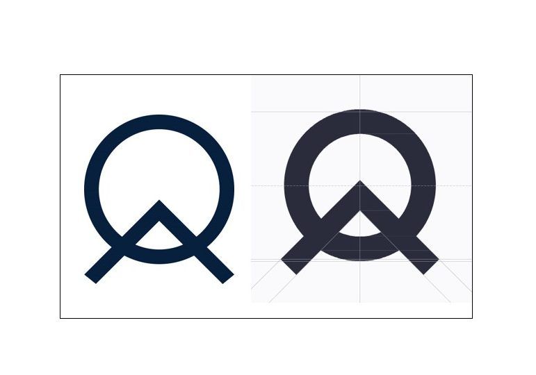
I have always had some interest in design, and enormously enjoyed working with the agency on how to make our brand different, more impactful, and more obvious. We also wanted to keep a continuum with our previous logo that I feel – beyond its simplicity –, communicates “intent” and a purpose.
One of the things I found particularly enjoyable was making the “big picture” and the smallest detail consistent. At the most granular level of the logo, everything was “reinvented”, increased thickness to represent the bigger impact and simplicity, angles, positions, lengths, letter spacing… the list goes on!
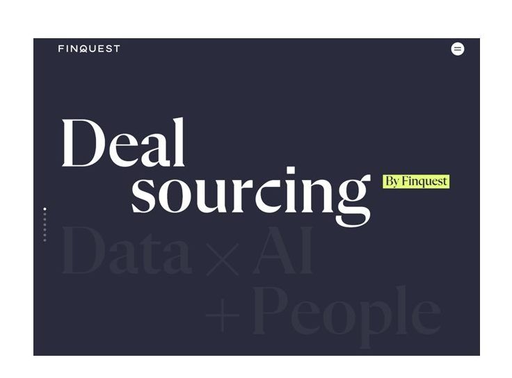
On the big picture, “different” (not outrageous), “to the bone”, “insanely straightforward and simple” were the principles that drove our approach. We also wanted to make obvious that the source of our success relies on our “Deal Sourcing Formula” (the unique combination of Data, AI and People), which has grown over the years to become our reference point. Finally, we feel the value we offer to the market lies in what we do and how we do it as opposed to more high-level statements, and we wanted this to be immediately clear.
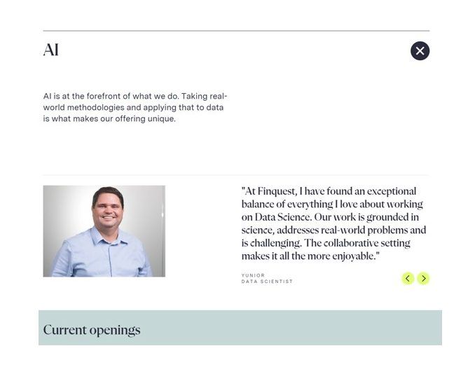
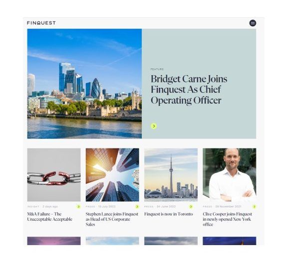
An exciting addition to our new website was the elevation of our people, who are inherent to our success. From surfacing examples of people in a variety of roles in a new “About Us” page to encouraging attributed content-contribution and marking key milestones in our “Insights” page; our people are what give us our unique identity and we wanted to celebrate that. Additionally, Finquest is in a unique position to bring more unique insight to the market in this space on the website.
As one of the founders and CEO of the company, presenting this to all our teams is one of these nervous moments, during which you are wondering if our new branding will be liked, accepted and embraced by all across our 24 nationalities, 9 offices, and in roles as different as Origination, Data Science, Data Moderators, Sales… The response turned out to be overwhelmingly positive and the consensus was one of excitement: that our visual identity now accurately represented what we all knew we stood, and strived for.
I invite you to explore our new website and brand; and hope you enjoy it as much as we do.
Tanguy
CEO & Co-Founder
